For the back cover's background, we came up with the idea to invert the colours of the front concrete effect, therefore creating a cohesive package through the tone and style of the covers, whilst also creating a defining factor for each and fulfilling the genre convention of a dark colour scheme. We also created continuity by using the same font as the front cover, but this time in white to stand out against the black background. It features a fictional track list that includes the song 'Tempered Tides'. We finished by putting a barcode, copyright information and record label logo on the bottom and creating our logo on Adobe Illustrator, using a magpie to continue the theme of the covers and link to the name of our record label - Magpie Media.
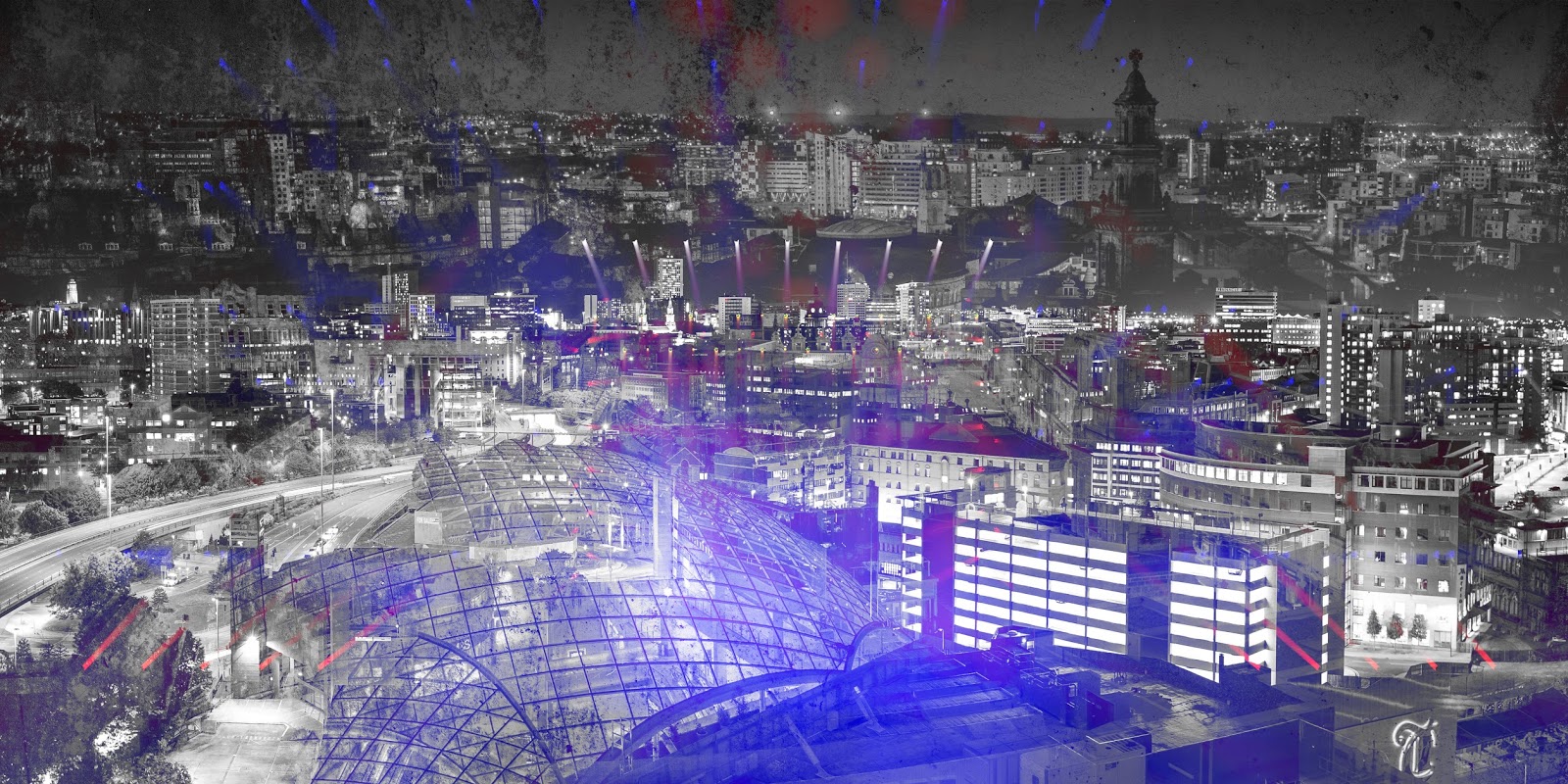
For our inlet, we decided we wanted to continue the theme of Leeds imagery and the pops of colour used in the front cover. Therefore, to create continuity, we used the same image of Leeds as in the magpie on the front cover as the main basis of the inlet and layered this over pictures of a gig with bright lighting. Furthermore, we wanted to continue through the 'grungy' tone established in the front and back covers, so we also layered in the same concrete background effect that is used in both of these templates. This creates cohesion between all 3 aspects of the digipak, making it one united product to effectively fit in with the genre conventions as well as the needs of the band and imagery in the song.


No comments:
Post a Comment