Having completed the video we decided to show it to different audiences to establish a general reception to the product and decide if there are any final changes we needed to make. Overall it was very positive; all the feedback we received went along the lines of 'looking very professional' and being 'aesthetically pleasing' and 'impressive' which is exceptionally encouraging as this is the best result we could've hoped for when we began this process.
Keeping the colour shift in was definitely the right decision - everyone commented on it and how it reflected the uplifting tone of the second storyline. This was really nice to hear as it was one of our original ideas and we're so pleased it's worked the way we intended it to. It also fulfils the band's desire to incorporate some colour into the video as this is a part of their image in promotions.
Another thing people commented on this time was the use of the diagetic sound of the band at the beginning and end of the video, saying it made it feel personal and like a 'gig', making them feel involved in the video. This is really positive feedback as the message will have more of an impact if the audience are invested in the video, which the feedback suggests they are. Furthermore, it's important for a new band to establish an initial audience base, therefore the welcoming, personal feel the dietetic sound adds to the video makes the viewer inclined to like the band themselves as well as their music.
As well as showing the video to different audiences, we also sent it to the band to get their feedback and to see if we incorporated all the elements they desired to ensure they approved of the final product. They said the video was "excellent" and "managed to capture a few of the topics of the lyrics really well". Even more encouragingly, they said they'd be "more than happy to use this as a 2017 version of the music video for Tempered Tides", asking for our permission to "stream it on (their) youtube channel" and "release the music video in conjunction with the label" they've now signed up to (Monomyth Records). Furthermore, they've asked us to put a credit list at the end of the video so our names will be released along with it to a wider audience which is very exciting.
The only piece of feedback we received from them was on our audio which needs to be "remastered" due to the "distortion" caused by the exporting process. We don't know why this is has happened but we are going to look into solutions to ensure the sound is better quality for the official release of the video.
Overall we are exceptionally happy with our feedback, especially from the band, which is predominantly positive, with the story being clearly communicated through our narrative and the band being presented in a personal, welcoming light.
Monday, 26 March 2018
Friday, 23 March 2018
Monday, 12 March 2018
Feedback For Our Second Rough Cut
Thankfully we managed to upload our video as a private link to youtube which has enabled us to show it to audiences to get some feedback without breaching the copyright terms. Although this is a rough cut so there is much more editing we need to do, it has allowed us to get a feel for the audience reactions and responses to the video.
Overall, they have been pretty positive. Everyone who saw the video understood the general gist of the narrative, reporting back their understanding that James had managed to turn his life around from homelessness. This is very reassuring as this is the main purpose of the video - to show that homelessness is a recoverable issue. They also said that it looked very professional and that the narrative was easy to follow despite being interspersed with the 'live performance'.
However, what was commonly not picked up on was the idea of the circular narrative, the fact that the story repeated itself. Although people understood that Jame's circumstances had changed due to him being given money to buy a train ticket, they didn't pick up on the idea that this happened in an alternative version of the same reality. A potential issue is the fact that several viewers picked up on the repeated shots but didn't understand what they meant, resulting in us looking like we didn't have enough footage to fill the video so had to re-use the same shots. This is definitely not the effect we wanted it to have and could make our video appear amateurish. To combat this I am going to show the video to more people asking them to take specific notice of the narrative and question them on whether they think the repeated shots were intentional or a mistake. This way we can determine our audience's interpretation of these shots instead of presuming they thought it was an accident.
Upon further questioning, the problematic shot appears to be the repetition of the bus pulling out of Leeds station. People are unsure of why this is being repeated as it isn't a shot of much significance (like the ones on the train or with the cup which are used for direct comparison). Therefore, I think we should either completely scrap the repetition of this shot and use footage of the band or add in more of the original establishing shots so we can demonstrate how we're back at the start again, rather than it appearing as a one off bus repetition which our audiences clearly don't understand.
Unfortunately, the feedback I received was very complementary of the colour change from black and white to colour. They said it reflected the improving storyline which was exactly what we wanted it to do and added another dynamic to the video. They also raised the idea of it representing new life, like springtime emerging from winter, which I thought was a really nice interpretation of the video that we hadn't actually considered. Therefore we now need to consider keeping this colour change in the video rather than it remaining in black and white. We have a little footage left to film in Leeds and we could focus this on getting some really interesting colours in the shots, possibly of James in front of lights and billboards so when the colour is introduced it is more striking and interesting rather than just being a bit bland.
I asked my audience if they thought the video matched the song and they were very complementary about this. They really picked up on the 'turn the tides' lyrics and linked these to James' life turning around. This improved their understanding of the narrative so our decision to begin the second storyline at these lyrics was definitely beneficial.
We were complemented on the 'smoothness' of our shots and the overall look of the video which we were told was professional and clean. I even asked my audiences what they thought of the differences between the footage of the band and the narrative and they didn't pick up on anything, suggesting that we don't actually need to re-shoot this section which is a big bonus for us.
We have been complemented on our editing too, they liked the way we accented beats and said it fit nicely to the pace of the song. We are really happy about this because we put a lot of effort into working out our pacing and deciding on the bars of music where we wanted to have certain events taking place. We are really glad this has come through in the overall editing of our video.
Audiences also enjoyed the jump-cutting effect repeated throughout the video to show the passing of time and create a motif through the video. They thought this made the video distinctive and gave it a point of differences to other narrative music videos, making it more memorable. This is really positive feedback and we're so happy that our audiences have picked up on the smaller details which we put into our editing process.
Overall, this rough cut has been given quite positive feedback. The majority of our decisions have been recognised and complemented, specifically our editing techniques and storyline, however, there's some pretty significant aspects we need to reconsider such as the presentation of the repeating narrative and the decision as to whether we remain in black and white or shift to colour.
Overall, they have been pretty positive. Everyone who saw the video understood the general gist of the narrative, reporting back their understanding that James had managed to turn his life around from homelessness. This is very reassuring as this is the main purpose of the video - to show that homelessness is a recoverable issue. They also said that it looked very professional and that the narrative was easy to follow despite being interspersed with the 'live performance'.
Upon further questioning, the problematic shot appears to be the repetition of the bus pulling out of Leeds station. People are unsure of why this is being repeated as it isn't a shot of much significance (like the ones on the train or with the cup which are used for direct comparison). Therefore, I think we should either completely scrap the repetition of this shot and use footage of the band or add in more of the original establishing shots so we can demonstrate how we're back at the start again, rather than it appearing as a one off bus repetition which our audiences clearly don't understand.
Unfortunately, the feedback I received was very complementary of the colour change from black and white to colour. They said it reflected the improving storyline which was exactly what we wanted it to do and added another dynamic to the video. They also raised the idea of it representing new life, like springtime emerging from winter, which I thought was a really nice interpretation of the video that we hadn't actually considered. Therefore we now need to consider keeping this colour change in the video rather than it remaining in black and white. We have a little footage left to film in Leeds and we could focus this on getting some really interesting colours in the shots, possibly of James in front of lights and billboards so when the colour is introduced it is more striking and interesting rather than just being a bit bland.
I asked my audience if they thought the video matched the song and they were very complementary about this. They really picked up on the 'turn the tides' lyrics and linked these to James' life turning around. This improved their understanding of the narrative so our decision to begin the second storyline at these lyrics was definitely beneficial.
We were complemented on the 'smoothness' of our shots and the overall look of the video which we were told was professional and clean. I even asked my audiences what they thought of the differences between the footage of the band and the narrative and they didn't pick up on anything, suggesting that we don't actually need to re-shoot this section which is a big bonus for us.
We have been complemented on our editing too, they liked the way we accented beats and said it fit nicely to the pace of the song. We are really happy about this because we put a lot of effort into working out our pacing and deciding on the bars of music where we wanted to have certain events taking place. We are really glad this has come through in the overall editing of our video.
Audiences also enjoyed the jump-cutting effect repeated throughout the video to show the passing of time and create a motif through the video. They thought this made the video distinctive and gave it a point of differences to other narrative music videos, making it more memorable. This is really positive feedback and we're so happy that our audiences have picked up on the smaller details which we put into our editing process.
Overall, this rough cut has been given quite positive feedback. The majority of our decisions have been recognised and complemented, specifically our editing techniques and storyline, however, there's some pretty significant aspects we need to reconsider such as the presentation of the repeating narrative and the decision as to whether we remain in black and white or shift to colour.
Friday, 2 March 2018
Digipak Back and Inlet
For the back cover's background, we came up with the idea to invert the colours of the front concrete effect, therefore creating a cohesive package through the tone and style of the covers, whilst also creating a defining factor for each and fulfilling the genre convention of a dark colour scheme. We also created continuity by using the same font as the front cover, but this time in white to stand out against the black background. It features a fictional track list that includes the song 'Tempered Tides'. We finished by putting a barcode, copyright information and record label logo on the bottom and creating our logo on Adobe Illustrator, using a magpie to continue the theme of the covers and link to the name of our record label - Magpie Media.

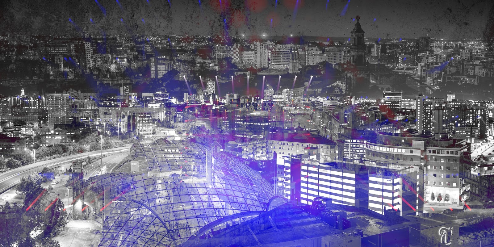
For our inlet, we decided we wanted to continue the theme of Leeds imagery and the pops of colour used in the front cover. Therefore, to create continuity, we used the same image of Leeds as in the magpie on the front cover as the main basis of the inlet and layered this over pictures of a gig with bright lighting. Furthermore, we wanted to continue through the 'grungy' tone established in the front and back covers, so we also layered in the same concrete background effect that is used in both of these templates. This creates cohesion between all 3 aspects of the digipak, making it one united product to effectively fit in with the genre conventions as well as the needs of the band and imagery in the song.


Subscribe to:
Comments (Atom)
Evaluation Q4
Question 4: How did we use media technologies in the construction, research and planning stages of our video? Before we had our online ...

-
STYLE OF MUSIC VIDEO 'Kerala' is a conceptual video with a loose narrative following a woman who is running through streets, di...
-
Question 4: How did we use media technologies in the construction, research and planning stages of our video? Before we had our online ...

